There’s a popular notion that working within constraints can be conducive to creativity. This is part of the appeal of developing pixel art games: given a limited resolution and color palette, the possibility space of what a game could look like is corralled somewhat. Within that space, the potential of what this game should look like becomes a more interesting and exciting challenge.
In the past, most of my pixel art games have inherited these technical limitations from the hardware they were intended to emulate. You Have to Win the Game utilized the default four-color CGA palette and 320×200 resolution of the GW-BASIC games I developed as a child. Its sequel Super Win the Game and the Gunmetal Arcadia cycle used the color palette of the NES and various interpretations of its screen resolution. Super Win had a 256×224 resolution, while the Gunmetal Arcadia titles used the full 256×240 size, but with eight pixels each clipped off the top and bottom of the screen when the CRT simulation were enabled for added authenticity.
I hope to continue making pixel art games in the future as time permits, and this prompts the question of what dimensions and color palette I’ll employ the next time. I’ve had fun aping the look and feel of generations past, but it feels like high time I started thinking about how a modern pixel art game should look. To this end, I’ve been developing tech (and a game design) that could scale better to widescreen and ultra-widescreen monitors instead of the 4:3 ratio I’ve enforced on previous titles. I’m also evaluating color palettes and looking at what worked and what didn’t work in developing tech and art for the NES color palette.
I must give credit where credit is due; much of this was inspired by GrafxKid’s Today Land Palette. I’d seen this one shared on Twitter a few times and instantly loved its vivid clarity. This work led me to LoSpec, which opened my eyes in terms of how to think about color palette design beyond simply identifying the failings I’d encountered in working with the NES palette.
But I’m getting ahead of myself. Let’s take a look at the NES palette and how I’ve used in on past projects.
This is a commonly accepted representation of the NES color palette (and is the source I used when authoring sprites for Super Win and the Gunmetals Arcadia), but it’s important to understand that due the analog nature of how the NES produced color, any digital sRGB representation is necessarily only an approximation.
This palette spans the entire spectrum of hues adequately, but it is notably lacking in dark and desaturated colors. This lends itself well to bright, cartoony art, but not so much to subtler tones. When NES games did attempt a grittier aesthetic, it was often by leaning heavily on dithered mixes of grays, browns, and blacks with other colors. (I modeled the look of Gunmetal Arcadia on Faxanadu, which employed these exact techniques to great affect and stands out as a uniquely grim and grimy entry in the NES catalog.)
Another limitation of the NES is the number of colors per sprite. Each sprite can have four colors, although one of these is typically reserved as a transparent mask value, so in practice, a sprite can realistically only have three colors. Some NES games, perhaps most famously Mega Man, would work around this restriction by overlaying multiple sprites on top of each other to create the illusion of a larger per-sprite palette.
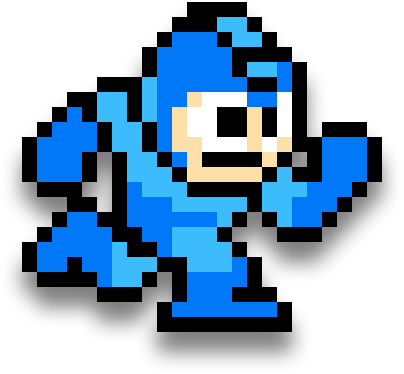
Mega Man’s face is a separate sprite, effectively adding his
skin tone and the whites of his eyes to a palette consisting of:
(1) transparent, (2) black, (3) light blue, and (4) dark blue
For Gunmetal Arcadia, however, I chose to work within the constraints of a strict three colors plus transparent per sprite. To this end, I also typically authored my sprites in grayscale, with the intent that they could support any three-color palette with relative dark, middle, and light values.


I found this to be effective in thinking about the legibility of sprites in terms of how bright they were, but I found myself occasionally disappointed by the results after coloring them. Sometimes patches of the middle gray would seem too light or too dark relative to the other values I’d chosen and it would take some tweaking of the sprite or its palettized colors to find something I was happy with.
This speaks to what I was really trying to do and wanting to be able to do: I wanted to author my sprites in grayscale at particular brightness values and trust that, when recolored, they would still maintain that same brightness per-pixel. And unfortunately, the NES color palette just doesn’t facilitate that. But what if there were another palette that could?
When I talk about “brightness,” what I’m really referring to is luma, the perceived intensity of an illuminated pixel as seen by the human eye and interpreted by the brain. As it turns out, sRGB pixel values that might intuitively seem equally “bright” may have radically different lumas due to the differences in brightness among the red, green, and blue components or a pixel. Understanding these discrepancies is key to producing a quality color palette.
Although displays may vary from device to device in terms of color reproduction, there are standards for calculating the luma of a pixel on modern devices. For the examples in this blog, I’m using the Rec. 709 luma coefficients, which (per this Wikipedia article), compute luma as:
Y′ = 0.2126 R′ + 0.7152 G′ + 0.0722 B′
It should be noted that these coefficients R’, G’, and B’ are not simply the digital sRGB pixel values in the range [0,255], but are instead the gamma-corrected values which can be approximated by dividing the sRGB values by 255 and powering by 1/2.2. (For a more accurate solution, see this Wikipedia article or this StackOverflow answer.) As these transformed values are each within the range of [0,1] and the coefficients sum to 1, the output luma Y’ will also be in the range [0,1].
So if I’m authoring sprites in grayscale, and I can compute luma values for each of the shades of gray I’ve chosen, then conceivably I could also find or compute color values across the spectrum that would share these same luma values. I could then recolor my sprites with these luma-respecting colors and trust that the output would appear appropriately bright relative to the original grayscale source.
So that’s a big, dense block of text, but that’s the core idea I had in mind when I started thinking about color palette design. Choose a number of fixed luma points in grayscale and then find colors with the same luma. Or, to paraphrase how I once put it on Twitter, do math at art.
All right, let’s circle back around to GrafxKid’s Today Land Palette and see how it compares to the NES palette when we look at the luma of each color.
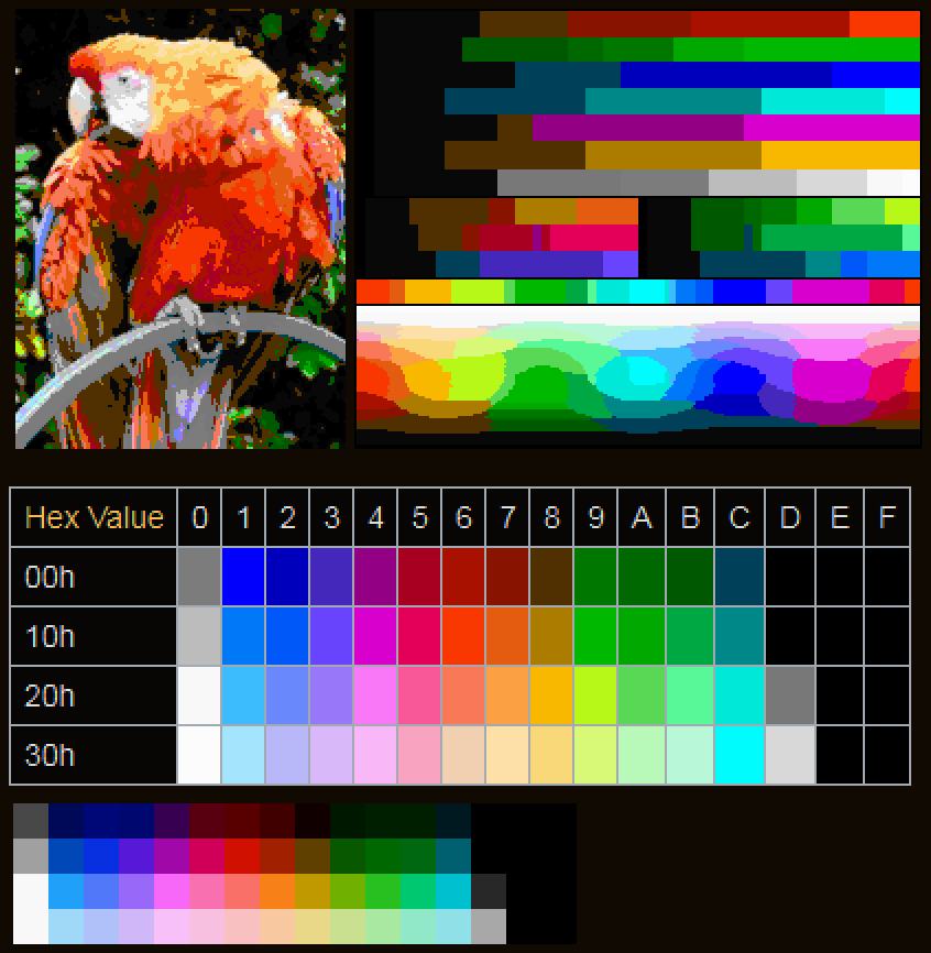
NES palette 
NES palette (luma only)
Here we see the NES color palette on the left, and the luma of each color on the right. (Luma in this and the following examples is calculated using the Rec. 709 method describe previously.) Clearly, it’s all over the place. The blues and purples are darker than the rest of the palette, as is the yellow/brown column just right of the middle, while the greens are much brighter than everything else. These are the sorts of discrepancies that gave me trouble when trying to match three-color palettes to previously authored grayscale sprites.
Today Land Palette 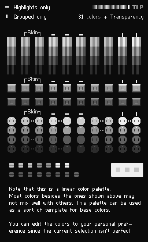
Today Land Palette (luma only)
Here is the aforementioned Today Land Palette by GrafxKid, with its corresponding luma values on the right. Immediately it is apparent it has much more consistent lumas across its entries, and I suspect this is part of why it appealed to me and why I felt it had a clarity that was missing from the NES palette. This seems to confirmed my hunch that a luma-respecting palette would be a big win, and that led me to a new idea: what if I designed a tool for creating a color palette that would enforce consistent luma?
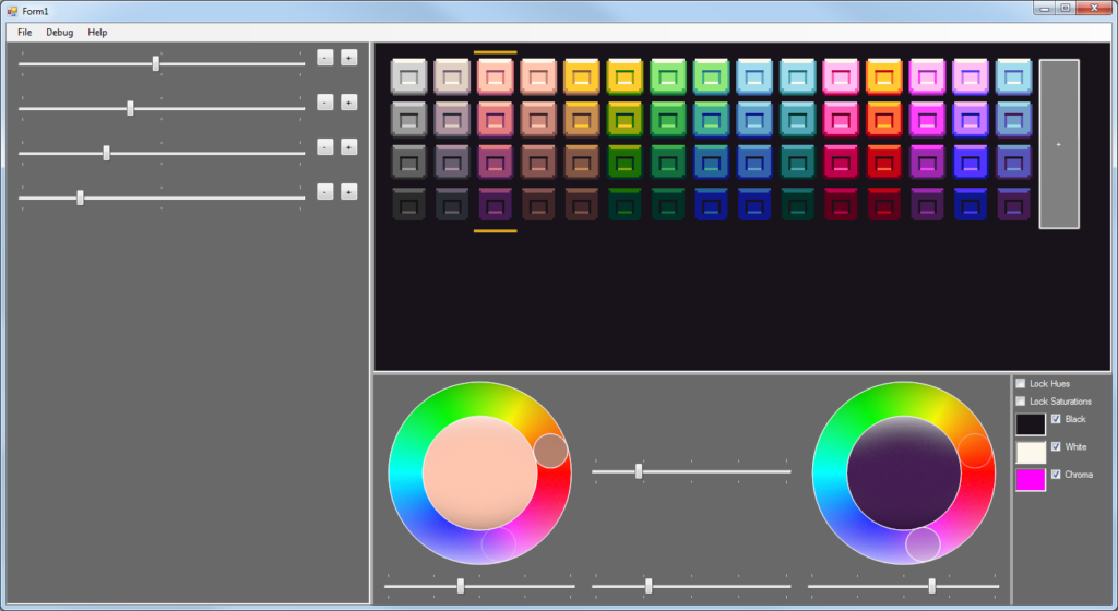
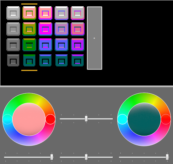
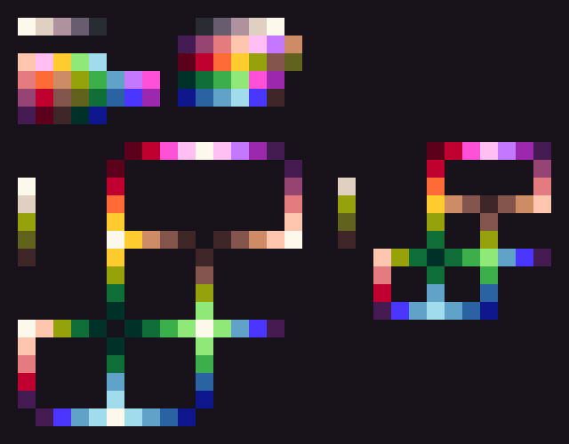
Palette tool interface 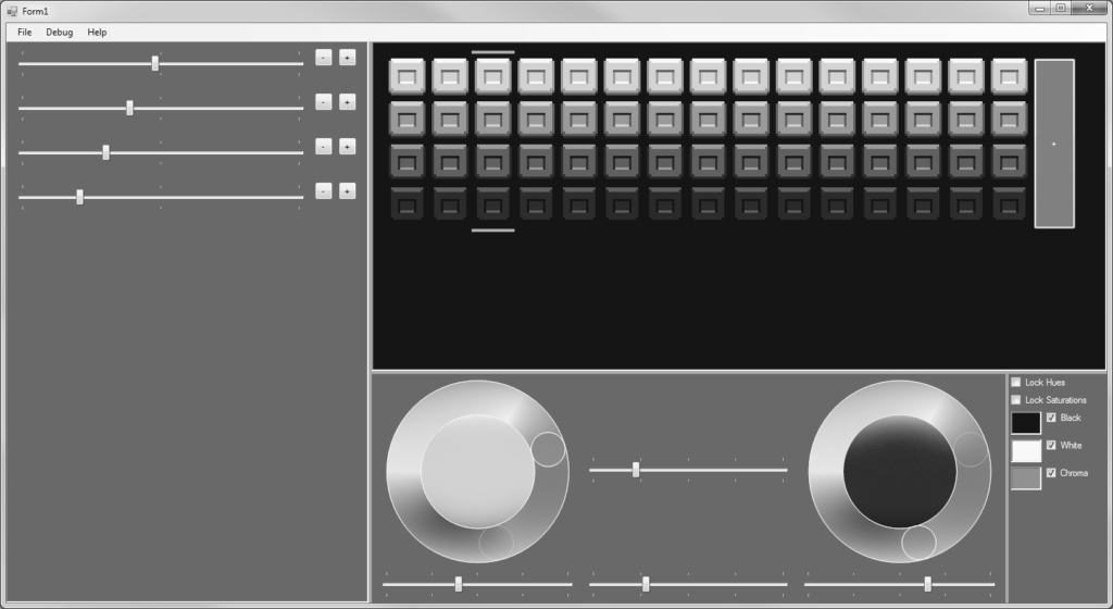
Palette tool interface (luma only)
So this is a rough draft of that. I know, I know, this is where I should put a download link, but trust me, this thing really isn’t ready for folks to start hammering on it yet. Aside from bugs and missing features, I’ve already identified a number of pitfalls in the fundamental approach I’ve chosen here, but it’s a start. With this tool, I can specify a number of fixed luma points (four in the above image, denoted by the sliders on the left), then I can create columns of colors with hue-saturation pairs defined at the top and bottom, and the values in between will be interpolated. As in the previous images, the right side is luma, and it should be clear the luma values are consistent across the entire palette.
Red to cyan, interpolated
through yellow/green
Red to cyan, interpolated
through blue/purple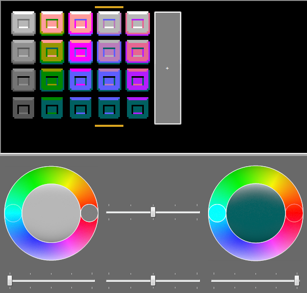
Zero saturation red,
curves unchanged
Zero saturation red,
curves adjusted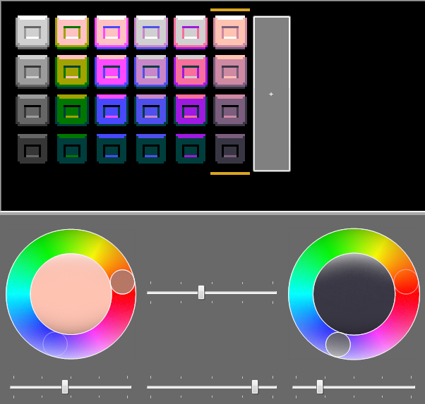
Example “warm to cool”
light skin tone column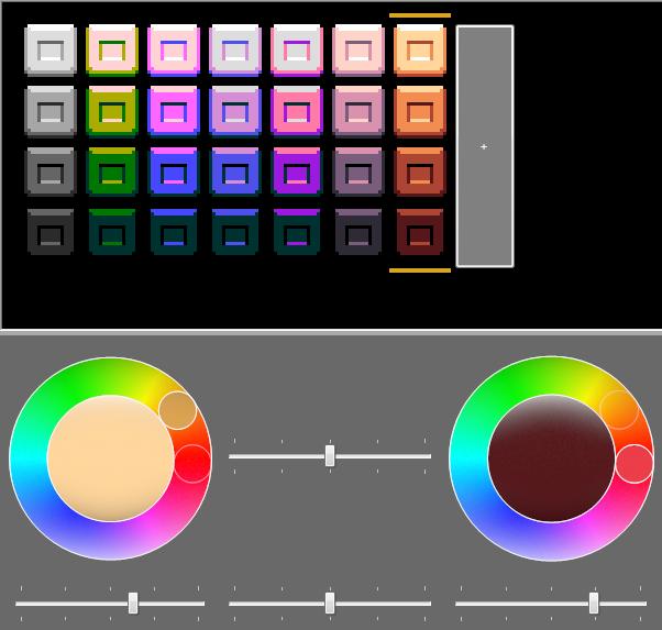
Example sepia tone column
The real magic here is how to actually compute a color given a target hue, saturation, and luma. (Hue-saturation-value colors are trivial to convert to and from sRGB, but value is not the same as luma, and enforcing the latter is somewhat less trivial.) The trick is that saturation must necessarily taper off as luma approaches one; it is not possible to have, for instance, a fully saturated red hue with a luma of one. The only value with a luma of one is pure white, which has no saturation. So in order to find a color given a target hue, saturation, and luma, we first need to know what the maximum saturation we can have for the given hue and luma is. I have yet to find a trivial formula for this, and my best solution so far has been to binary search nearby values, narrowing down the possibilities until they are so small that they would produce no change in an sRGB color with components quantized to 256 values. (These could then also be written to a two-dimensional lookup table for faster retrieval.)
Hue increasing left to right,
luma increasing bottom to top,
maximum allowed saturation
Maximum allowed saturation
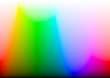
To illustrate that wordy block of text, what we have on the left here is an image of the entire color spectrum at maximum saturation, with hue advancing from left to right and luma increasing linearly from bottom to top. On the right is the maximum saturation allowed for each hue/luma value on the left. To better understand this, take a look at the low dip around blue. That valley corresponds to the sRGB value (0,0,255), or pure blue. That’s fairly dark in terms of luma, but we can’t produce a brighter blue that is still only blue. If we want a brighter color, we must necessarily add green and red components, which have the effect of rolling back the saturation and bringing us closer to white.
In developing this tool and refining an example color palette to prove its potential, I discovered the practice of mapping colors to a two-dimensional space, placing intersecting strips of color on a graph to better illustrate their relationships. As I was already constructing my palette strictly in terms of light-to-dark columns, this mapped perfectly to a grid. It’s highly likely a second draft of my palette tool would eschew the rigid column structure for a map of this sort.
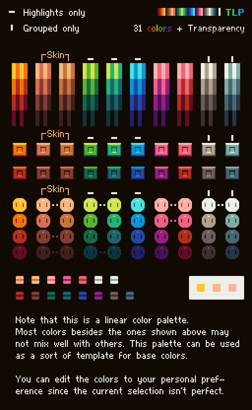
Verse32 palette 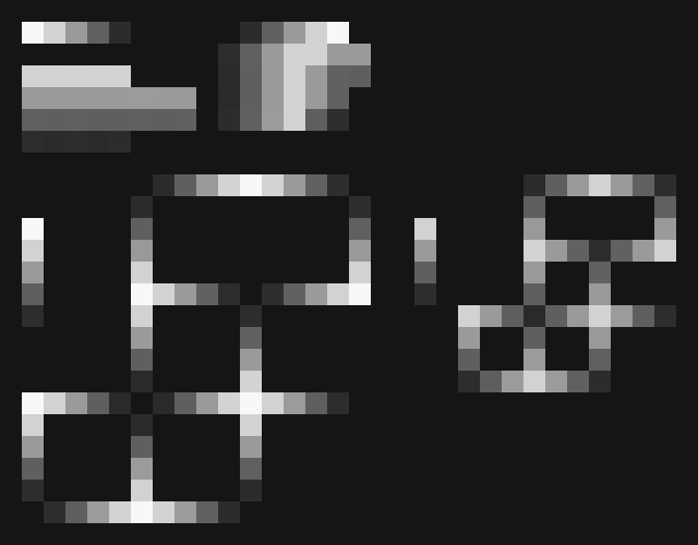
Verse32 palette (luma only)
This is a 32-color palette I designed to prove this approach. As illustrated by the luma image on the right, the entries all have consistent lumas, which should help facilitate spriting in grayscale as I did in Gunmetal Arcadia.
I was hoping to cap off this blog with a nice pixel art visual to demonstrate this color palette in practice, but art is hard and this thing is already way late. Maybe one of these days when I have more time (snrk), I’ll come back to that.

Recent Comments